
Using Color Psychology in Home Decor
Color has a strong influence on mood.
When setting up a room, or redecorating (I love to rearrange a room to change the energy!) consider the purpose of the space and the energy you want to create. The joke in my house is if you give me a wall, I’ll paint it green. Which, besides the 40+ color mural I painted with my friend under our team name RuEsKa, is a pretty accurate statement. I think the reasoning behind this is I want a peaceful relaxing home to retreat to after busy, stimulating city life days. And the color green does just that to our psyches, it brings a sense of calm.
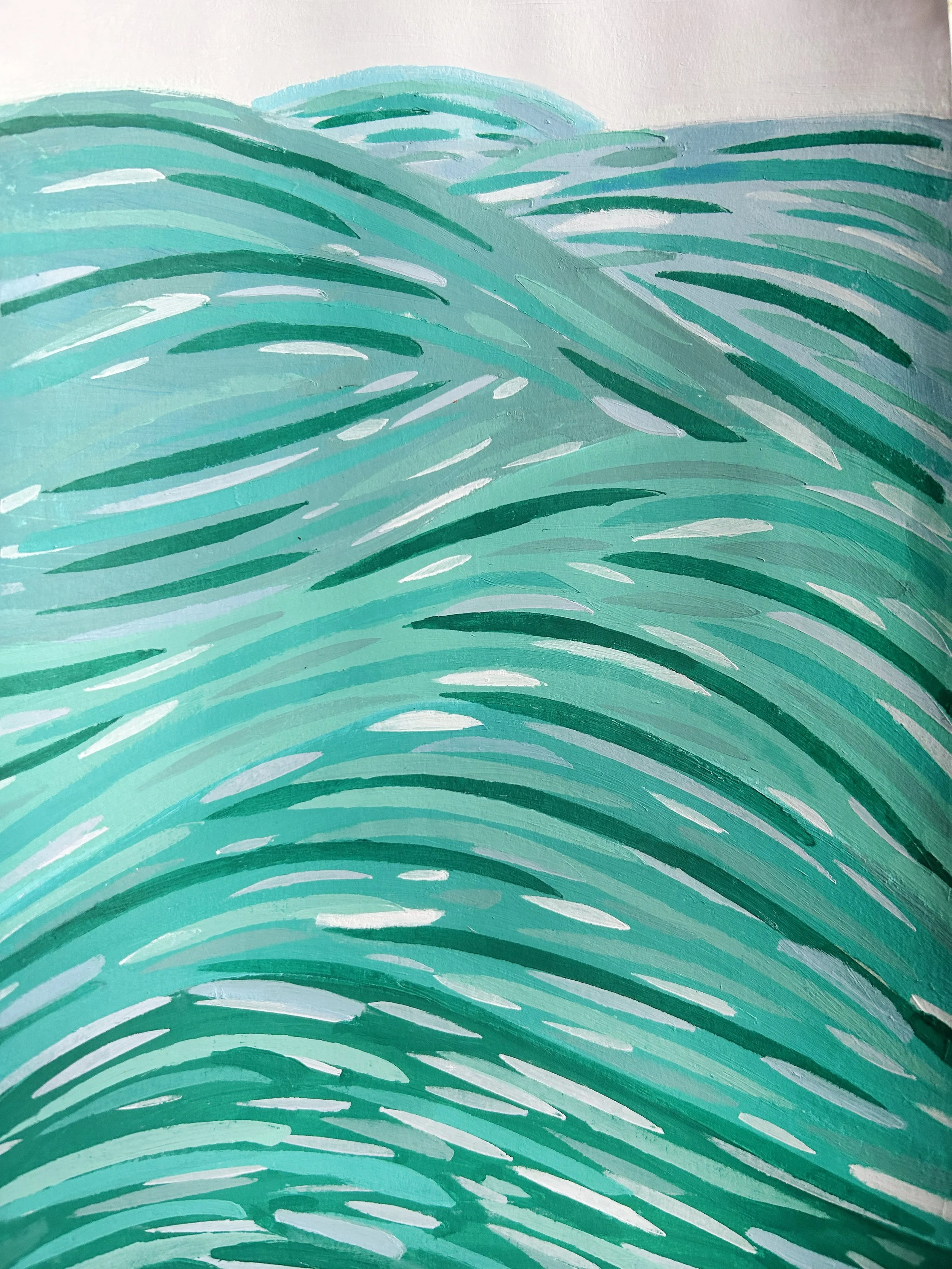
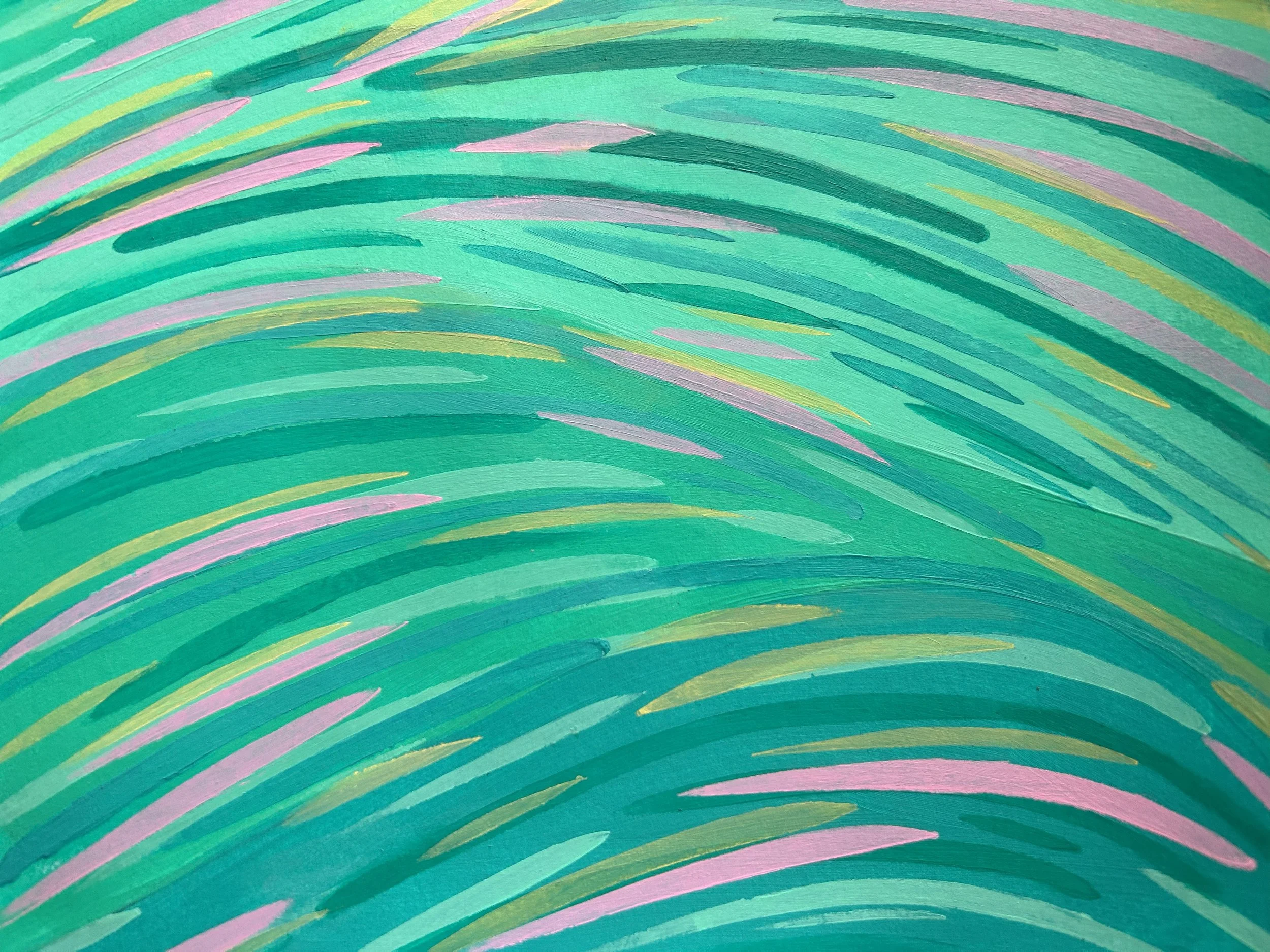
Green represents nature, balance, and renewal. One of the most soothing colors, green is deeply relaxing, helps lower stress, and can reduce anxiety. Great for living rooms, bedrooms, or anywhere you retreat to for peaceful moments.
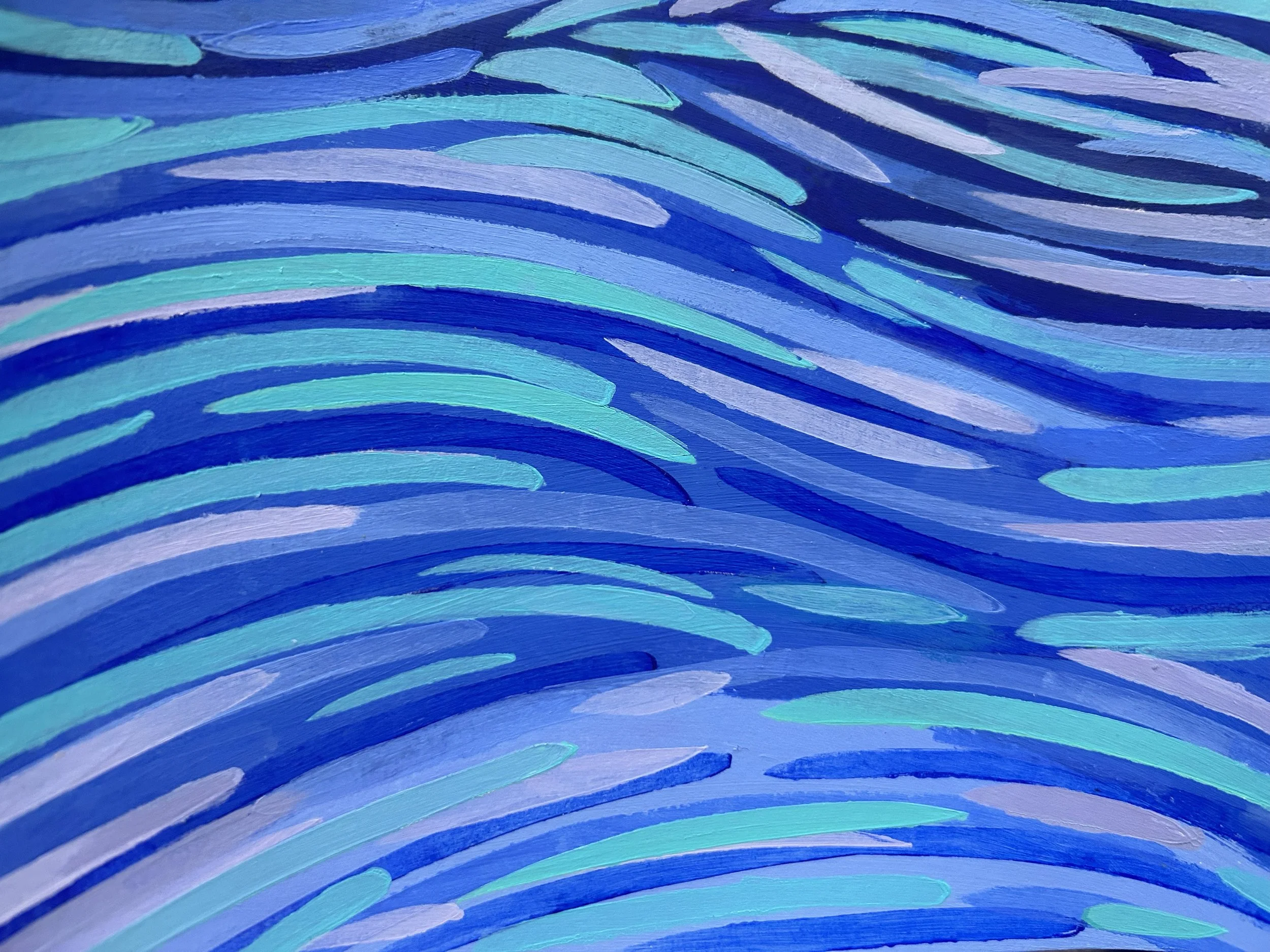
Blue has a similar energy of relaxation, while also conveying stability, wisdom, safety, and trust. The deeper hues allow space for self reflection. In a bedroom or study it gives space for decompression at the end of the day, and an opportunity to go deeper into your feelings. I think blue is great for accents in the bathroom, if that is space you go to unwind.
Mix green with blue and instantly lift your spirits. Mimicing the tranquil seas of tropical waters, turquoise can easily transport you to another place.
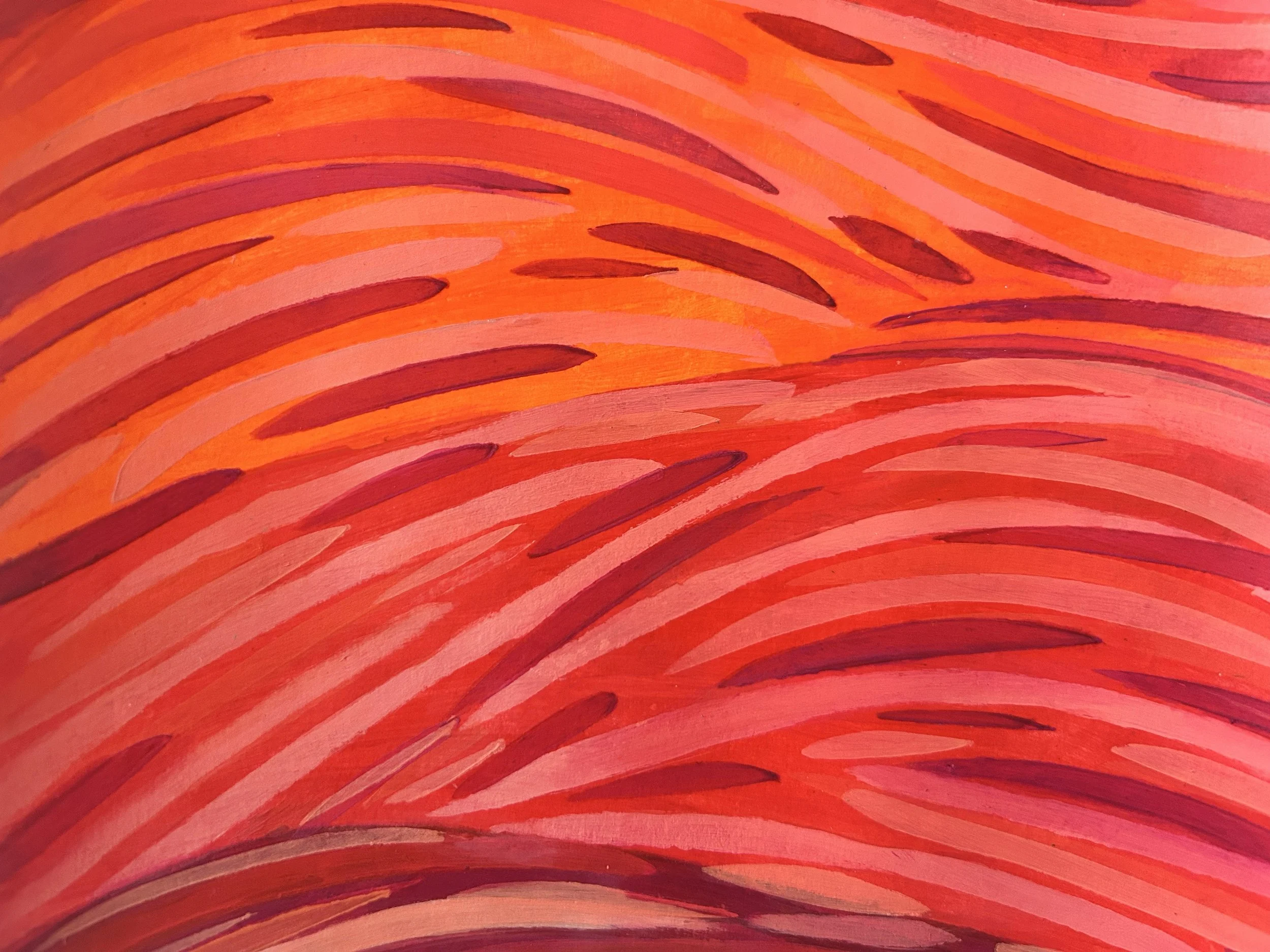
Red represents energy, passion, action, desire, and excitement. Bright hues give a passionate, energized, assertive vibe, while deeper hues evoke feelings of richness, earthiness, and decadence. Strategic placement of red in your home can kick start your energy for a productive and energetic day. I like to place red in the kitchen, in a breakfast nook, or in a workspace where you want to create an energizing vibe. Add white to red and you have pink, which is playful, wild, romantic, and also softer blush pink is soft, sensitive and sweet.
Orange is enthusiasm, warmth, and fun. Bright hues are friendly, and optimistic, while burnt shade are warmer, and rustic. Often used in seasonal decorating, orange can easily evoke the feelings of the season of change. However a strong accent of bright orange sparks happiness instantly. You don’t need a lot of this color to get the affects of it.
Yellow is happiness, optimism, caution. Bright yellow communicates joy, and grabs your attention. Lighter hues are cheerful and welcoming. You will often see yellow used on the front of a house or right inside the door, to communicate “this home is joyful” while welcoming you back to it.
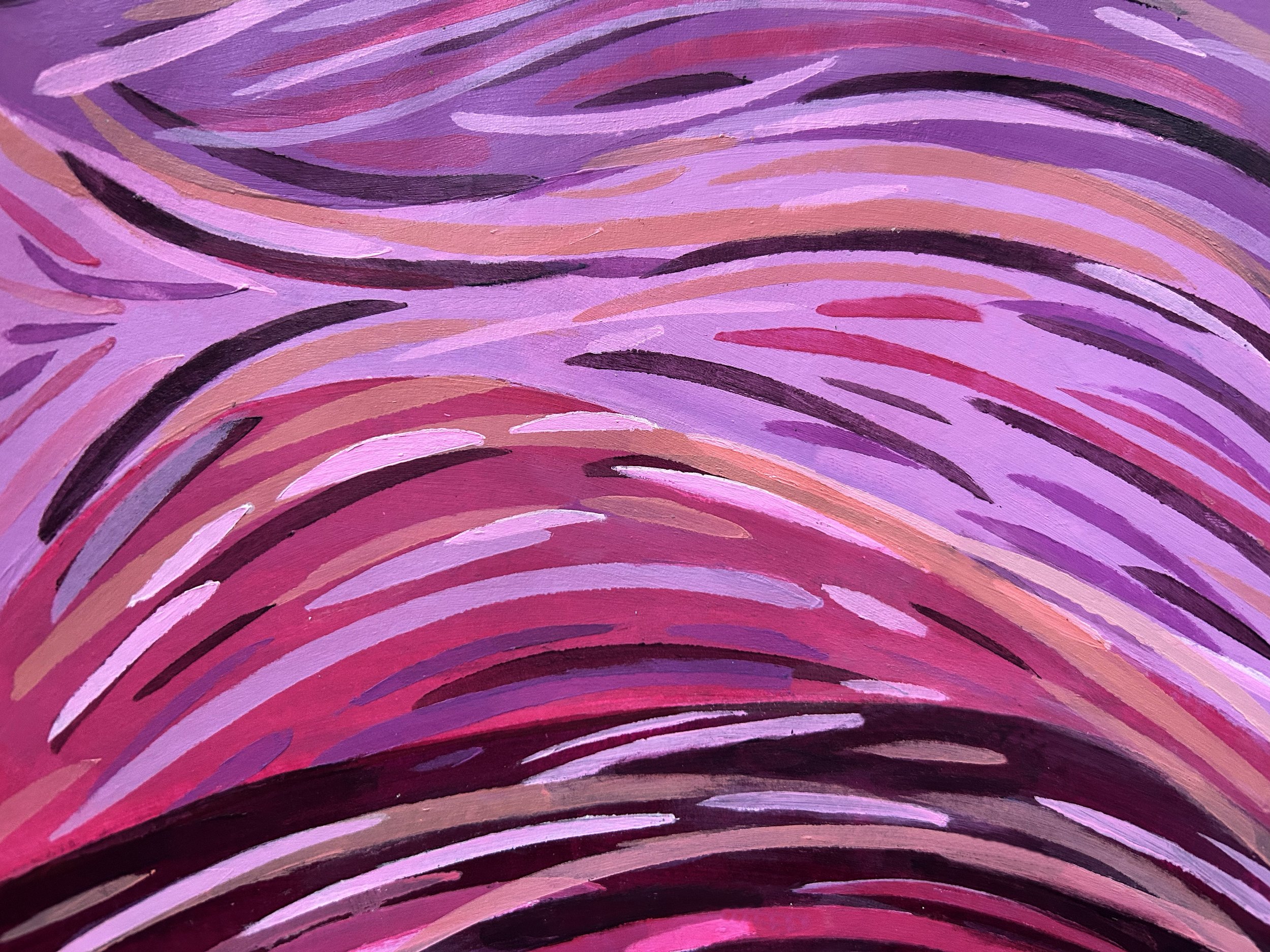
Purple shifts our moods towards luxury, mystery, spirituality, and imagination. Bright hues are creative and mystical. Deep hues communicate royalty, and sophistication. Lavender is a softer more soothing version of that creative charm. Purple really transforms a space into a creative zone. Purple pinks are great in kids playrooms, studios, or home office.
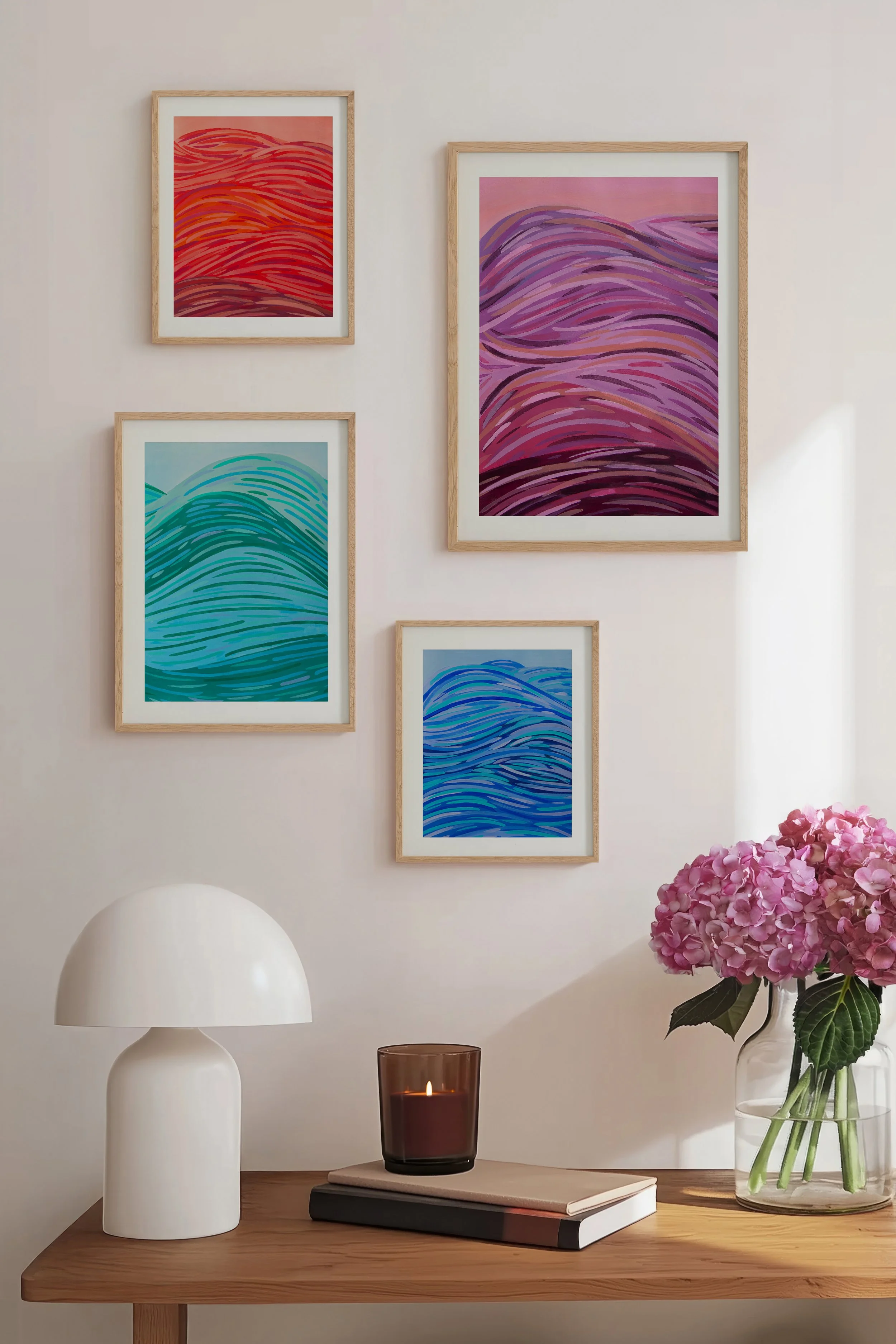
There are endless ways to bring color into your home including accents in furnishings, pillows, bedding, table decor, plants, upholstery, and wall color. My favorite way to influence a room with a specific mood is to invest in art that speaks that emotional language. Check out my website’s shop by mood page to explore more how color psychology can help create the mood you crave.